|
Over the past semester, I've learned a lot about the importance of planning out my pieces. I learned to brainstorm a list of ideas and sketch different perspectives of those ideas. Doing this helps me decide which idea will be the most enjoyable to paint. After I decide which piece to paint, I plan further by printing out photos of what is going to be in the piece and make a colored sketch. The colored sketch and photos help me decide a color scheme and perspective.
Ive learned a lot about different mediums this semester. My first piece in this class was done in prisma color pencils. I learned that you have to do many light layers to build up opaque colors. I chose to draw leaves with a butterfly on them. This project was frustrating because it took a long time to do small areas and it showed me that I'm not patient enough to enjoy using prisma colors. The piece turned out alright, but there are some areas that aren't as opaque as they should be becasue I was rushing to finish. I also learned about using oils this semester. They quickly became my favorite medium. I like that they blend so easily. However, they are messy and get everywhere. It is also hard to fix a mistake if you over-blend. I did a landscape of mountains in oil and really enjoyed painting the sky. It was a foggy/cloudy sky and the colors blended well together. Oils also require a bit of patience like prisma colors because you have to wait for them to dry. This process can be sped up by adding liquin to the paint. Liquin also helps the oils glide over the canvas easily. I've done several paintings in oils now and I'm glad that I'm getting the hang of using them. I even learned a lot about a medium that I already use, acrylic paint. We did a self portrait and learned how to make skin tones and draw facial features. It was difficult painting the portrait because acrylics dry quickly and it is hard to match the color once the paint is dry. To help this, I learned to make the skin tones before painting. The most helpful thing I learned was to push the lights and darks of the skin colors to give the painting more depth and make it look realistic. This class helped me learn a lot about mediums that I had never used before, as well as ones that I thought I knew a lot about. I learned about brushstrokes, colors, planning, and patience. Overall, I've improved a lot over the semester. I've been drawing, sketching, or painting almost everyday for this class and the practice has helped me develop my own style and find out what I'm good at and what I enjoy. In the future, I will continue to plan out my pieces before hand and learn about painting through trial and error.
0 Comments
Oil Practice Painting Process Finished 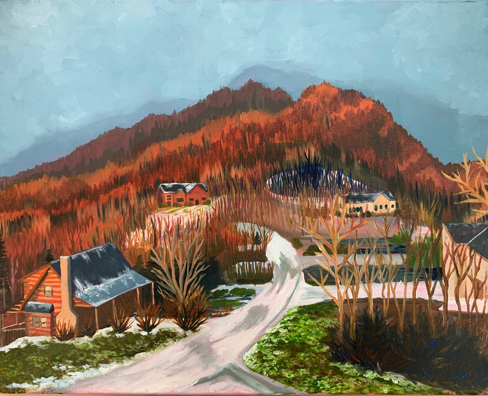 For my oil landscape I decided to use a picture that I took in Boone while my family was on Christmas vacation. I used this picture because I wanted to give my grandma something meaningful for Christmas and this was her favorite photo from the trip. To prepare for the painting, I made a rough sketch and a colored sketch of the photo. I also practiced using oils by painting a chicken and mini landscape. Then, I sketched the outlines of houses and mountains on the canvas. When I actually started painting I started with the sky then worked my way down to the road and cabins.
I found it difficult to get the perspective of the cabins correct but they ended up looking fine after I tweaked some lines. It was also difficult to make the mountain ridges different colors without all of the tree lines blending together. I remedied this by waiting until the last layer of paint I applied was dry before adding a new one. I learned about time management while working on this project. It took a long time for different ares to dry so I skipped around to different sides of the painting and worked on other spots while waiting. I like how the mountains and sky ended up. I think I did a good job showing the highlights on the houses and ridges with golden colors. I also like how the sky looks kind of foggy with the white blended in. Every time I work with oil I learn something new and it has grown to be one of my favorite mediums. In Progress: Finished: 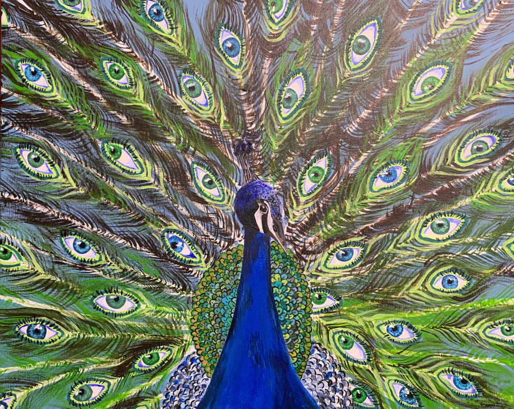 When I came up with this idea, I knew I wanted to make something for my aunt's birthday. Her favorite animal is a peacock and I thought it would be cool to add eyes to the feathers instead of dots to make it extraordinary. I found it challenging to envision what the end piece was supposed to look like. I had sketches, but they didn't look quite right. I was mostly worried about how I would paint the feathers without all of them blending together. I made sure that they didn't by layering contrasting bright greens with dark browns. To paint this, I worked my way from the background to the foreground. I started with the eyes, then the feathers, then the body. I learned a lot about painting eyes and the different values in them from this project because of how many I worked on. I also got to practice color matching in the body feathers because I had to let the paint dry so that it wouldn't smudge. I like how this painting turned out, but I wish the body feathers and eyes were more realistic. Overall, I'm happy with how the peacocks head and the contrasting greens and browns in the background turned out.
Reference pictures In progress pictures Finished Piece 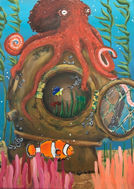 While coming up with this idea I made a list of 20 interior spaces. I chose to do a dive helmet because my dad was a diver and I needed to give him a gift for his birthday. While making this, I found it difficult to make the helmet look old. I made it work by adding green algae, barnacles, and rust spots. I also found it hard to show that there were things inside the helmet. To fix this, I made one of the tentacles wrap around the edge of the opening. Then, I made the edges of the inside darker than the middle to show depth.
I made the piece by painting the background and sand first, then the helmet, anemones, clownfish, and octopus. I worked from the background forward to prevent any colors from overlapping in the wrong place. On the helmet, I painted countless layers of browns, reds, golds, and greens to create an aged and dull look. On the octopus, I had a hard time showing the bumpy texture. I pulled it off by using a small round brush to tap different oranges and reds on to show bumps. I learned a lot about color from this project. I learned to add colors that you don't normally see right away in order to make the piece more realistic. For example, I put some purple in the orange clownfish and some blue in the red octopus. Overall I'm happy with how this piece turned out. I think I did a good job with the placement of the octopus and the tilt of the helmet. I grew a lot from painting this and I'll be proud to give it to my dad.  Before I could start this project I had to take a bunch of photos of myself with different expressions. I decided to do a simple smiling picture. While I painted this I had a hard time getting the proportions of the face right and I found it difficult to get the shadows and highlights accurate. I put a base color down first and then built up the shadows and highlights around the face. I learned to push the shadows and highlights to make them more intense than I had originally thought to. I also learned a lot about mixing skin tones. To start, I did the face, then the hair, then the headband, background, and flower design. I tried several different colors for the background, but I decided to make the headband, lips, and background the same color to create harmony in the piece. I also incorporated gold into the hair, earring, and background to make it pop while keeping it cohesive. I disliked how little time I had to blend the colors before the paint dried because it was difficult to make the skin look smooth. The process was frustrating, but overall I'm happy with how the piece turned out. I think I did a good job mixing and blending the skin tones for my first time painting a portrait. I'm also glad that I was able to place the facial features in the right spots. I grew a lot through this project, and now I'm confident that I can create a successful portrait.
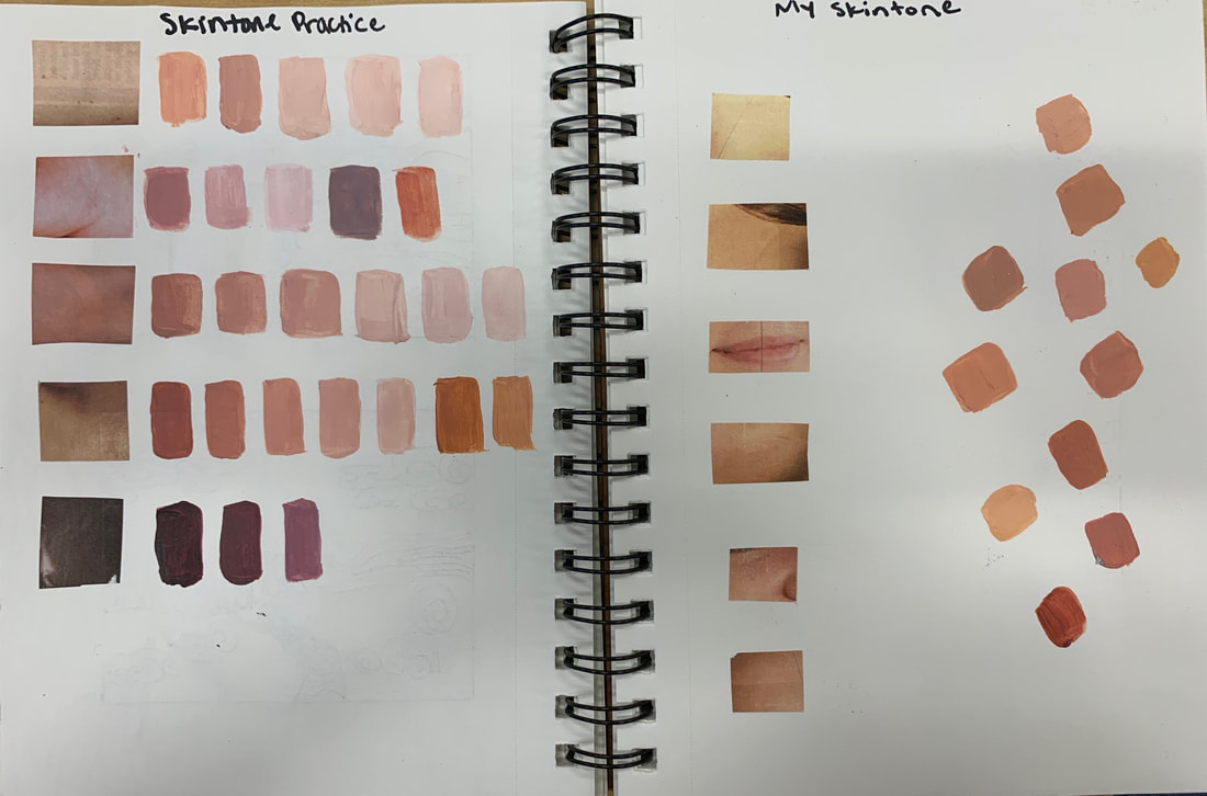 To prepare for the self portrait we cut skin tones out of a magazine and matched them with paint. I also created different shades of each skin tone. Next, we cut out pictures from our photos and matched our skin tones.
To practice for our self portrait we learned how to draw eyes, lips, and noses. We did these exercises to see where the shadows and highlights were and how the features were proportioned. We also learned where the features go on the face and how to space them out using an eye (bottom left picture).
 While coming up with this idea I made a list of 20 reflective things and 20 things that could be reflected. I chose to draw a butterfly on a leaf reflected in water because I wanted to try to show all the colors in the leaf and stem. The hardest part of this project was figuring out how to make the background. In the original picture the background was filled with too many leaves and stems to draw. To fix this I blended a bunch of greens and browns together. I added several light layers to build up colors and shadows. My favorite thing about this piece is the pink stem. It has many layers and transitions smoothly between colors. Through this project I learned that patience is key when working with prisma colors. You have to put down several light layers to create an opaque color. I became better at drawing with prisma color throughout the project by learning how to take my time and be careful with which colors I put where.
I decided to draw a butterfly reflected in raindrops on a leaf for the project. I cropped the picture several times and changed the position of the butterfly for the compositional sketches. In my final sketch I decided which position I would use and what colors to use on the butterfly.
   To practice for our upcoming project, I drew an avocado and lemon with prismacolors. I like how the seed in the avocado turned out but I wish I did more layers in the green part to make it look smoother.
|


Photo used under Creative Commons from nahid-v
