Reference Photos and SketchesIn ProgressFinal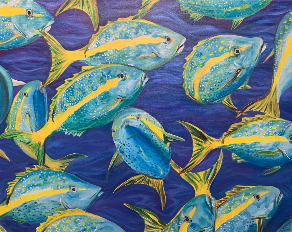 I saved this for the last piece of my concentration because I was dreading all of the work I needed to put into each fish. I used oil paints to make blending easier, but I feel like I over blended on some of the fish and the oil made it difficult to keep the colors from dragging. First, I painted the background and sketched out the fish. Then I painted the fish white and started on their colors. For each fish I tried to make the yellow stripes and dots different to make it feel natural. I spent a lot of time highlighting the scales with white by stippling with a small brush. I wish I had used a smaller brush to detail the fins so they didn't look so bulky. I like how most of the fish turned out, but I really have a problem with the one in the middle. I couldn't get its proportions right and I didn't know where to put the eyes. I made them too close together and now the fish looks goofy. I wish I had put that fish off in the corner or anywhere that isn't the middle of the painting. It's the first thing your eyes go to, but hopefully the yellow in the other fish is too distracting to keep the attention on that one messed up fish. I like the contrast of the yellow and blue, I did a good job balancing out the main colors on the canvas.
0 Comments
Reference Photos and SketchesIn ProgressFinal I made this piece with the inspiration of a few old surfing photos of my dad. I used oil paints because I wanted to be able to blend all of the colors in the waves together and make it feel fluid and smooth. I used 3 different photos and painted different waves from each of them. I was going to add a surfer, but I wanted to keep it simple. I feel that this piece captures my concentration, Movement In Water, very well. I worked hard to study the way the water flowed on and around the waves in the photos then added extra color to make it more interesting. I wasn't planning on adding red, but in the white areas the red underpainting showed through, even after several layers of paint. I don't mind how it looks though, I like how it brightens and warms up the foreground against the dull background/sky. Painting the barrel of the wave was the hardest part of this piece. I kept adding more color because I wasn't sure how to incorporate the yellow without it standing out too much. To solve this, I put more yellow throughout the painting so it would match . Then, I painted the reflection of the barrel and at the bottom of the wave. I added a rough texture to the foam by blotting heavy layers of paint onto the canvas. Next, I took a very small brush and added white splashes around the foam to make it look more realistic. I also used a small brush to create the sparkling white highlights on the water. Overall, I really like this piece.
Reference Photo and Sketches:In Progress:Final: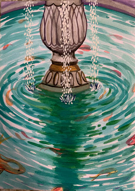 I based this piece off of a picture I took of a koi fountain. I played around with different placements and positions for the fish, but decided that I liked the symmetry of the painting when they were all circling around the fountain. I used watercolor for this, and I found it somewhat difficult. The colors easily bled into one another, which helped when I was painting the water, but I had to be careful not to drag the oranges and reds of the koi around. Looking back, I could have added more details to all of the fish, but you wouldn't be able to see those details underwater anyway. I enjoyed painting the fountain because it was easy to let the grays and browns bleed into each other and create a tarnished look. I also like the contrast of color between the oranges/reds and the blues/greens. I wanted the main focus of the painting to be the water, and I think the dullness of the fountain brings your eyes down to the water and fish. The back wall is gray/purple because I didn't want it to blend in or take away focus from the fountain or water. I finished the piece by adding 3 little waterfalls from the fountain. I like the calm, cohesive, but also worn feel of this painting. It isn't as complex as most of my pieces but it is satisfying to look at.
Refrence Picture and Sketches:Final: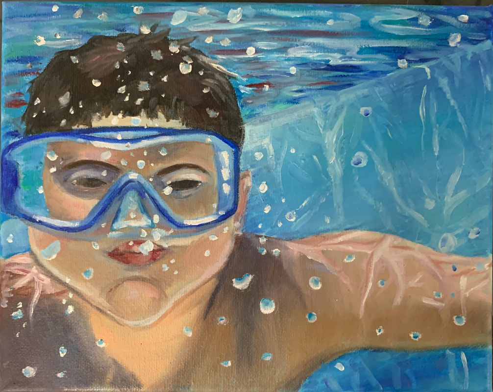 I based this painting off of a picture of my cousin in the pool. I used oils, and encountered a lot of problems while painting this. It also took the longest to paint so far out of my pieces. I had to mix a lot of paint to figure out what color his skin is because I'm not well practiced in mixing skin tones. The fact that it's underwater also made making the skin harder because I had to really push the darks and figure out how to include the highlights from the water around him. I think I did a good job pushing the darks around the shoulders and face. The original picture is old and kind of fuzzy so I had to take a picture of it on my phone and sharpen the image and increase the saturation to make the colors brighter. I started by painting tiles on the back wall, but realized it looked kind of weird and took away from the depth of the painting. Then I tried to make it blurry so it would look better, but I decided I didn't like that either and just painted over it. I'm glad that I did because it made it easier to see the refraction of light against the wall. The surface of the water was also difficult to decide how to do because I wanted it to show the colors around and beneath it but still look like it was moving and refracting light. I used short brushstrokes of reds, blues, greens, and white. Instead of using red, I should have used a color closer to his skin tone. I added bubbles to bring the piece together and cover up any imperfections. Overall, I'm not mad at how this turned out. I like how his skin and goggles turned out and it was a good challenge.
Reference Photos :Sketches: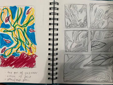 Progress Photos:Final: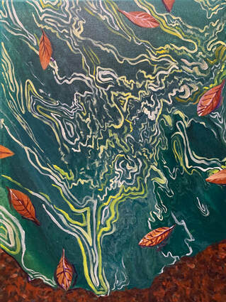 I got the inspiration for this piece from a puddle filled with pollen. The wind had blown it into cool swirly patterns that I thought would be fun to recreate. I made the base by pouring layers of paint into a cup then flipping it onto the canvas and letting it flow. The colors didn't turn out as strong as I'd hoped so I went over the lines with white and yellow acrylic. Then I added leaves and painted veins on them to add depth. I also used purple in the water around the leaves to make them pop. I made the ground around the puddle look like dirt by adding several different shades of reds and browns. I enjoyed making this painting because it was it was interesting seeing how the pollen moved around the leaves.
Reference Pictures & SketchesIn ProgressFinal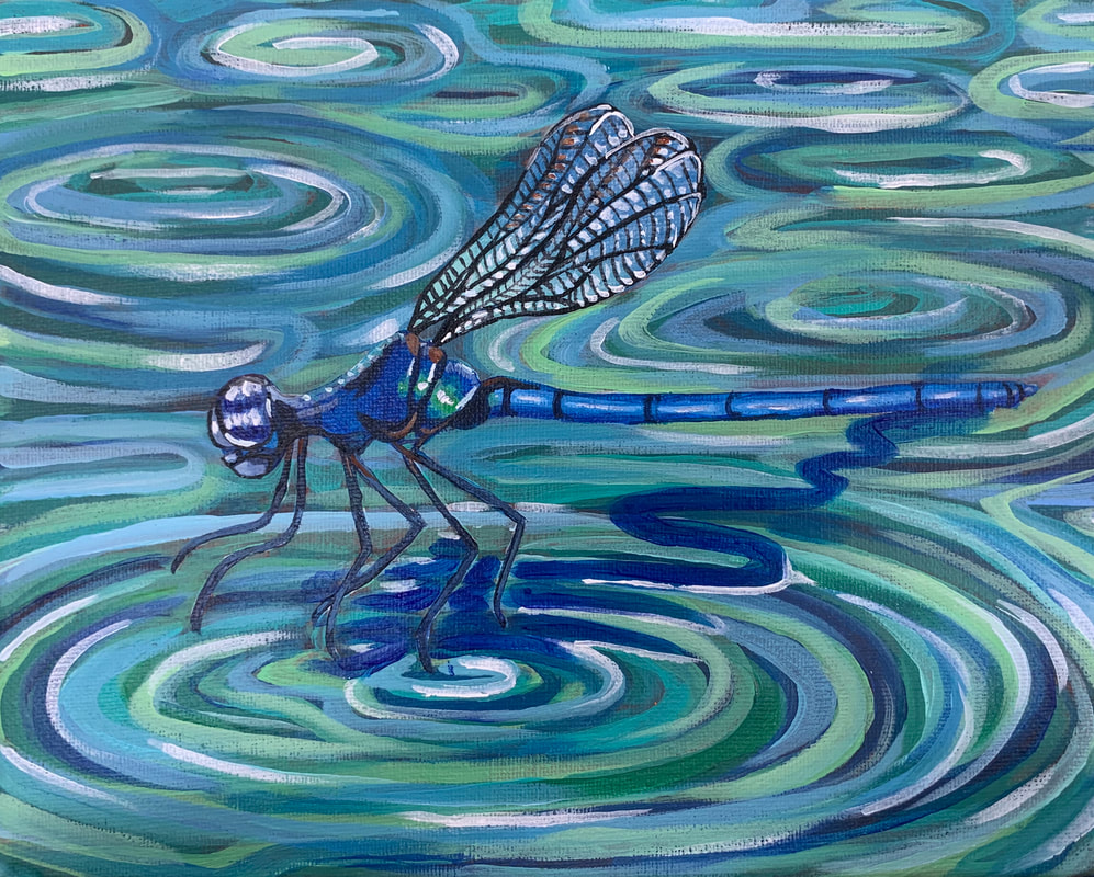 For this piece, I used acrylic paint. I chose to use this medium because I thought it would be easier to work with when doing tiny details like the patterns on the wings. For the wings, I did a light white wash to create a translucent surface to paint the dark patterns on. Then I added blue and white highlights to show the reflection of light and water. I tried to make the body as detailed as possible by adding light blue highlights and dark blue shadows to the body, as well as making a reflective effect on its torso with green and white. I like the color scheme of this painting. I like that the dragonfly matches the water, I think it feels almost dreamy. The ripples in the water have good a perspective and don't feel flat. This is because of all the colors I used to create depth. I added the dragonfly's shadow in the water, and I think it's the right color, it's just a little too thick to look as realistic as I would like it to. I like this painting overall, but its not my favorite piece I've done.
Reference Photos & SketchesIn ProgressFinal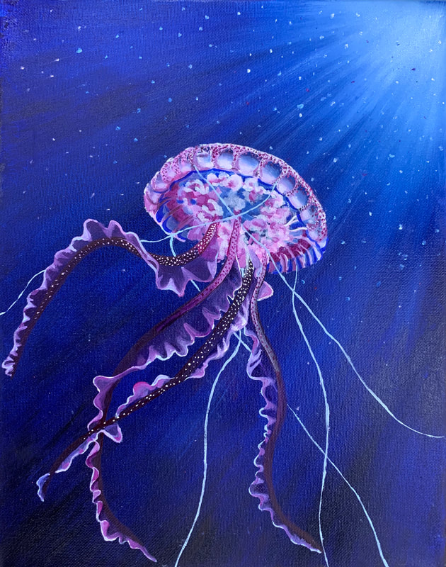 I really enjoyed painting this. It is one of my favorite oil paintings that I've done because I feel I successfully created depth in the background by starting with light blue oils at the top then fading to darker blue towards the bottom of the canvas. I blended the light colors down into the dark, creating a refraction effect throughout the water. I also added different light-colored flecks in the water to represent the microorganisms in the ocean. For the jellyfish, I used purple, pink, and white against the blue without completely covering it to create the transparency of the jelly membrane. Then I created the cloudy area under the jellyfish's bell by blending pink and white together. I think this shows how loose and almost unattached this area is, adding to the fluidity of the painting. The tentacles and arms also add a lot of fluidity to this piece. I had them going in all different directions to make it feel like the water currents were gently swaying them. I started with the arms, and made them a dark plum color, then I added white and red dots to contrast against them. I made the outside of the arms transparent by using a very dark blue/purple, outlined and blended with bright pinks and white. These colors help bring the eye down to the bottom of the canvas. I added bright white tentacles, starting at the bell, and moving to the edges of the canvas. I think this helps a lot with making the piece feel fluid and almost graceful. They also move your eye around the entire painting because of their placements. This piece was very enjoyable to work on, it was relaxing to paint while still pushing my comfort zone as an artist. For example, I'm not used to painting transparent things and this helped me realize it's all about where you put the highlights. I like this piece because it adds to my concentration by succesfully showing movement in water.
Sketches and ReferencesIn ProgressFinal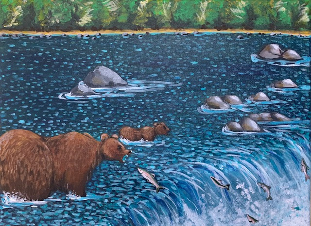 I found this project the most boring so far out of all of my concentration pieces. I wish I had gone with the concept sketch of the bear's open mouth catching the fish. I feel like that would have been more fun to paint but it wouldn't have focused on movement in water. I also wish I had done this in oil to make the blending easier. I like how the rocks and waterfall turned out. I used different shades of gray and brown on the rocks to create highlights and a smoothed over look. I used several different blues in the waterfall to create depth and added white splashes at the bottom to show the rough movement of the water. You can also see the movement of the water against the bears legs, where the water is almost pushing them forward. The tiny blue brushstrokes everywhere in the water are bigger and longer towards the foreground and thinner towards the background to create the look of rushing water. I wish I had added more colors in the water, maybe greens or browns to give it a more earthy tone. I could also improve the painting by adding colors like orange or yellow to the bear's fur, I think it looks kind of flat. I think I did an okay job on the background, I didn't want the trees to be in focus so i used dry brushstrokes of greens, yellows, and white to make a dense forest. Overall, I don't like this painting, it feels too plain and boring.
Planning: In Progress: Final: 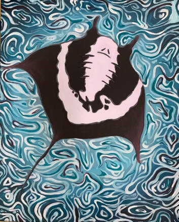 For my second piece, I decided to paint a stingray from the underside view. I used acrylics for this, and I really like how the water/ background looks. It was fun to paint and I like the fluidity of it. I used several colors in the water because I wanted to create depth and motion. After I did the outline of the stingray, I started painting the water by using a light blue in the middle and fading it to dark as it went to the sides of the painting. Then, I did several different colors to create the water's surface look. I wanted it to look wavy and calm rather than choppy so I used fluid smooth lines and added lighter and darker colors to create depth. Last, I painted the stingray. I did the basic outlines of color then went in and added depth to the sides, gills, and eyes.
I didn't really like painting with acrylics for this piece because it dried too fast for me to be able to blend how I wanted to. When I tried to blend the sides of the stingray I used water to help incorporate the lighter color, but the texture of the canvas came through. Overall, I'm okay with how the final product looks, mostly because I feel like the water makes up for the rest of the painting. References, Sketching, and PlanningIn Progress Photos Final Piece 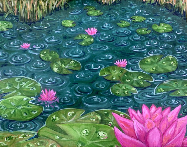 For the first piece in my concentration, Movement of Water, I painted a pond of lily pads. This piece relates to my concentration because the raindrops ripple and move the water. I enjoyed painting this, I like the cool color pallet with the pop of pink in the flowers. I planned by printing out photos of lily pads and raindrops, then sketching several scenes with different perspectives of the pads and flowers. I like the perspective I chose because the flower in the foreground brings the eye to the front while the flowers in the mid ground pull the eye across the painting to the grass in the background. However, I feel like some of the lily pads are uneven and throw off the perspective.
I like the values in the raindrops and ripples, they add depth to the water and make it feel like a stormy day, the cool color palette helps with this as well since you can't actually see the sky. I also like how I did the raindrops on the lily pads, although I should have been neater with my paintbrush. I didn't have a paintbrush small enough to make the tiny raindrops that I wanted, but the size variation makes it look somewhat realistic. I wish I had made the size of the ripples in the water more varied, it would have made the scene look more natural. The grass in the background has many colors and shades in it. My favorite part of this piece is probably the values in the grass and the shadows in the water close to it. The groups of grass add balance to the painting so all of the attention isn't directed to the foreground. With this project I learned about oil paints, a medium that I thought I was used to by now. I found it difficult to keep my area and clothes clean because I was working fast trying to get it done in time. I learned to wear clothes that I don't care about and keep a semi-clean rag near to wipe paint and turpentine on. I also learned that liquin is better to use in the second layer of paint so the layer won't be transparent. This project was tedious but I'm okay with the final product. |
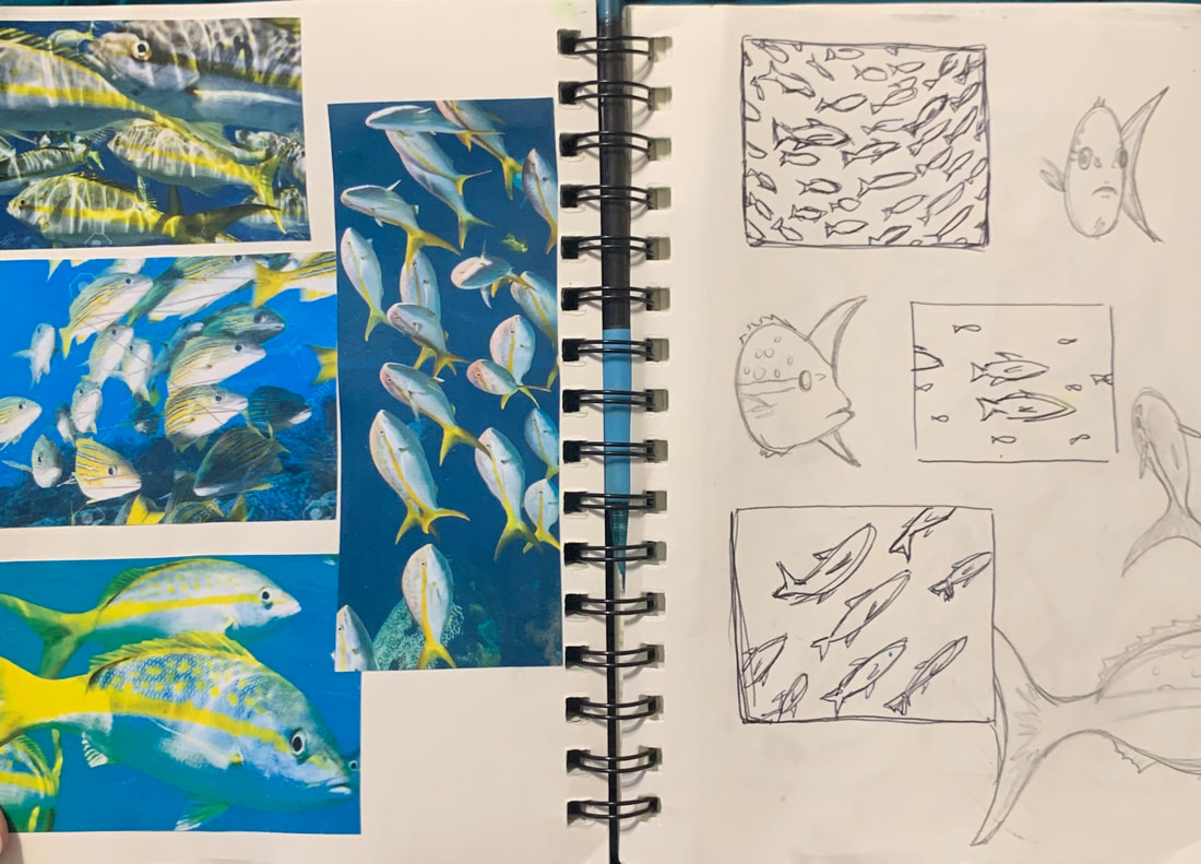
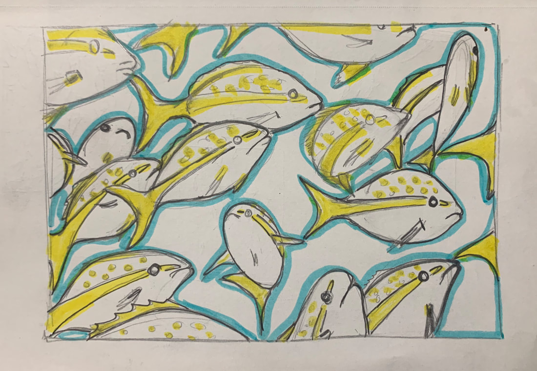
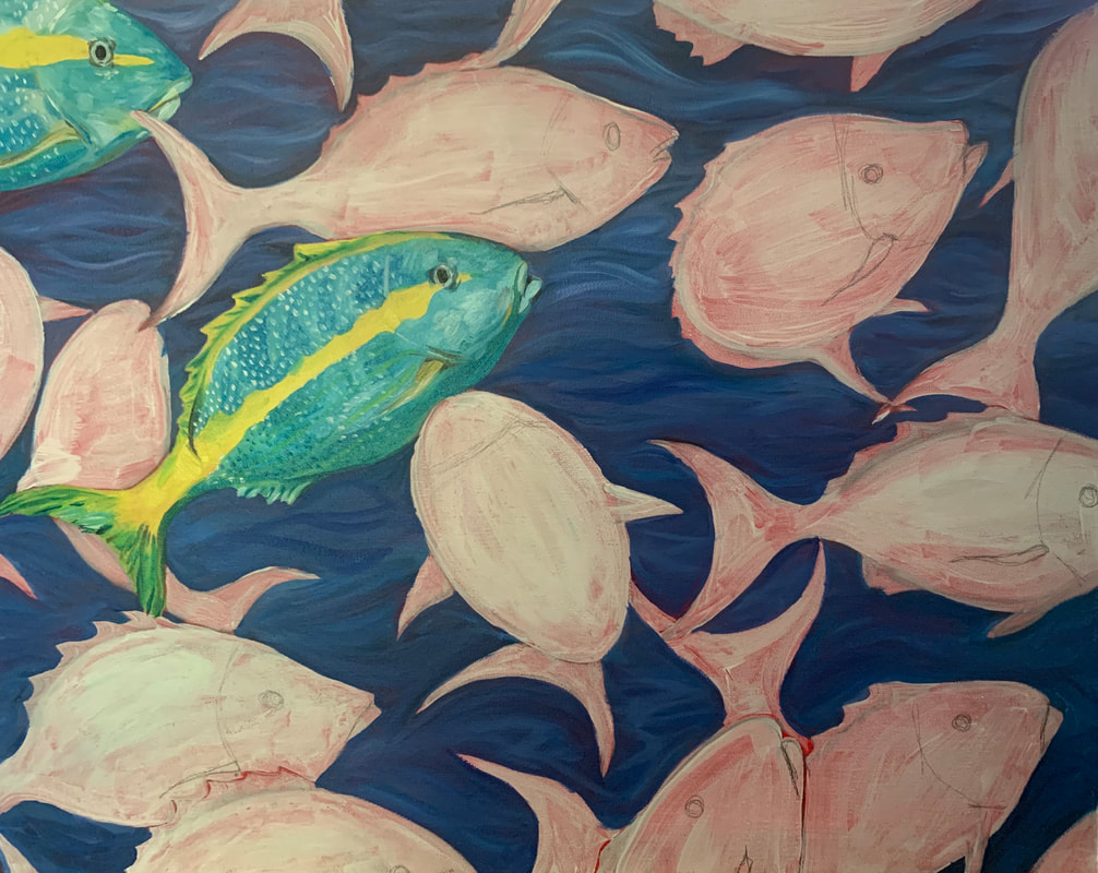
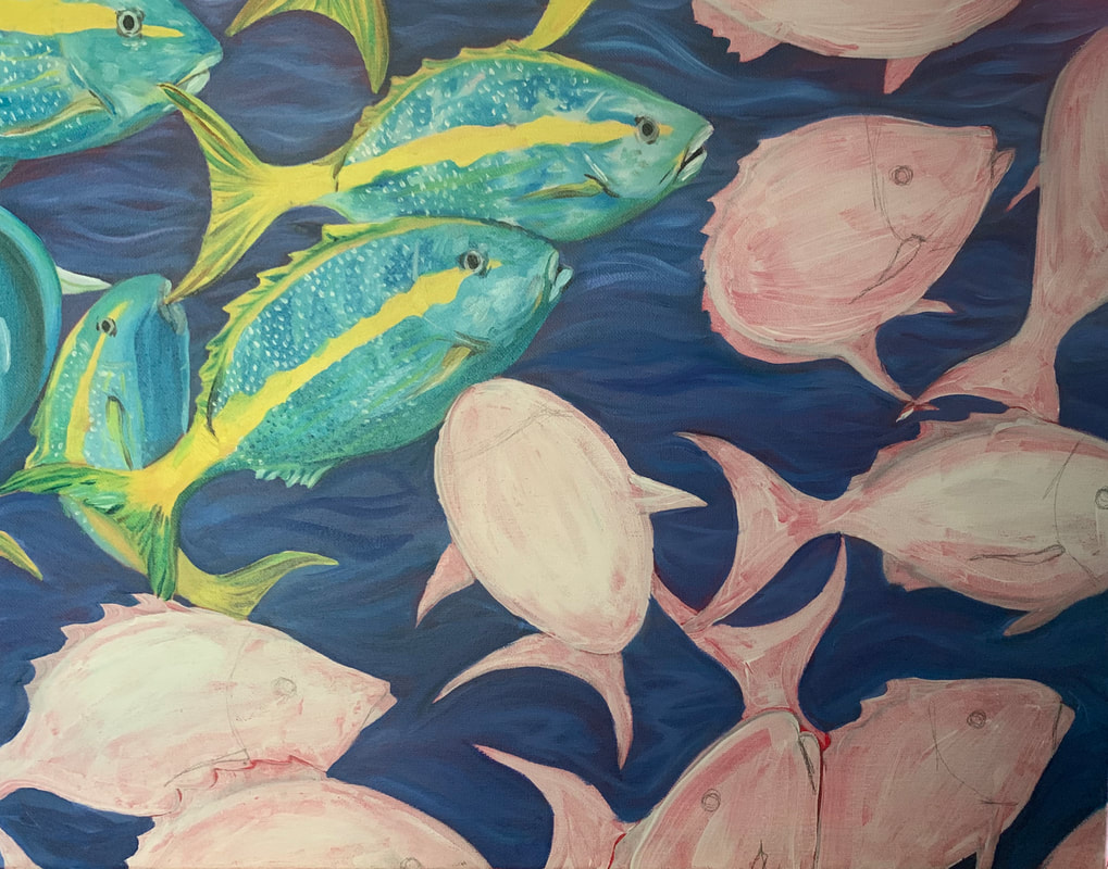
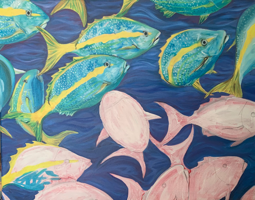
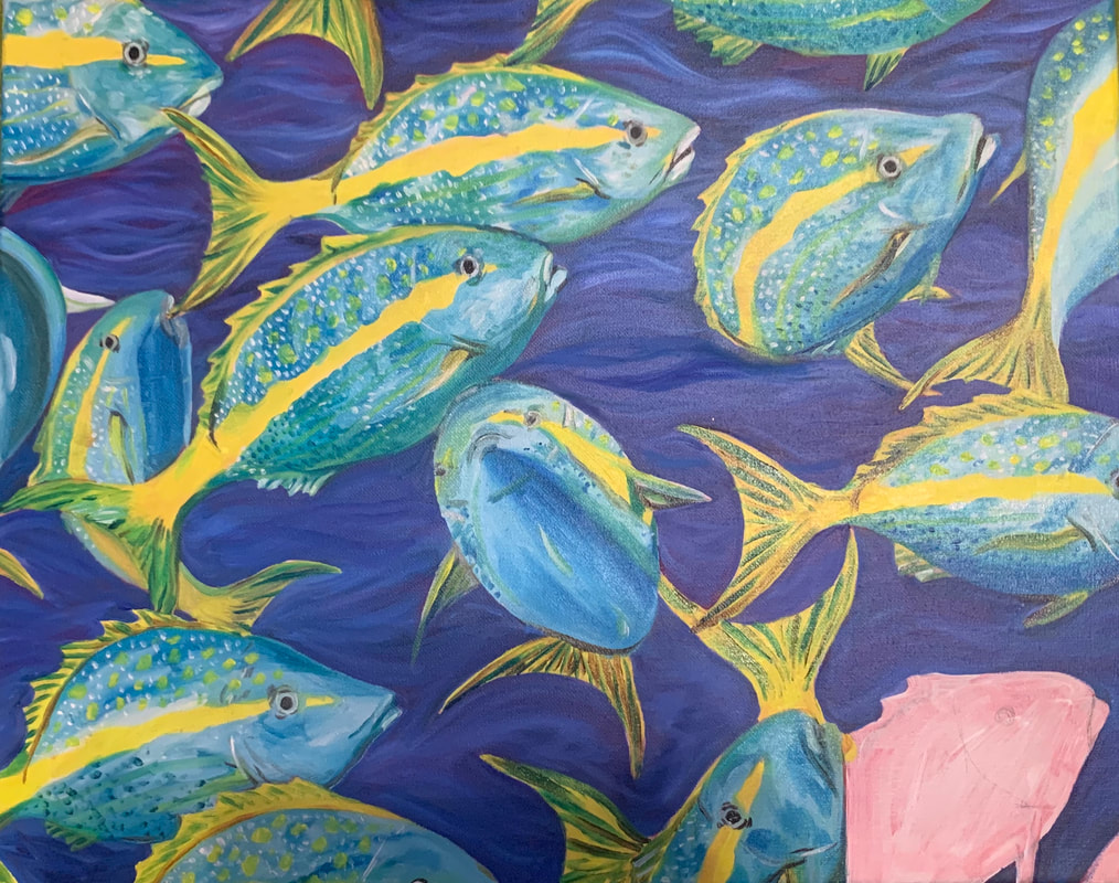
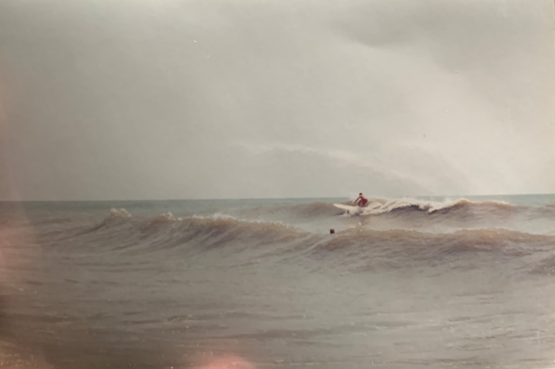
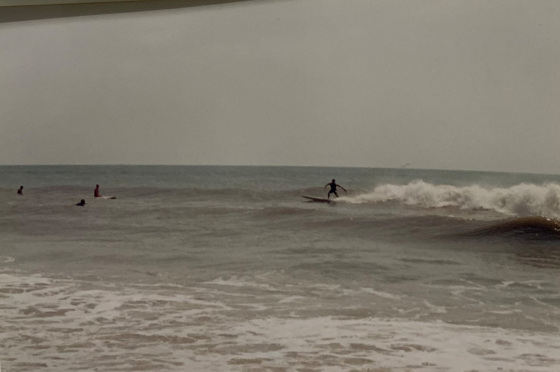
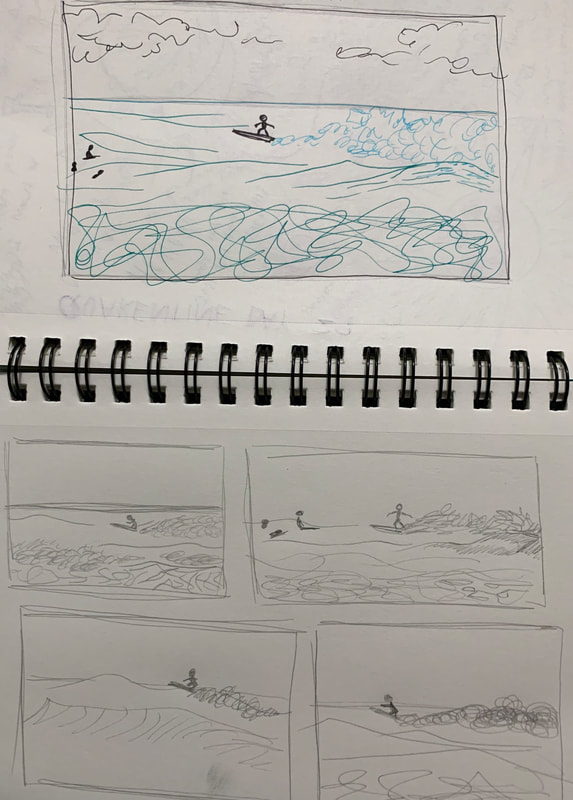
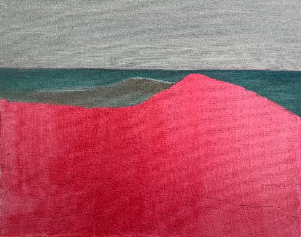
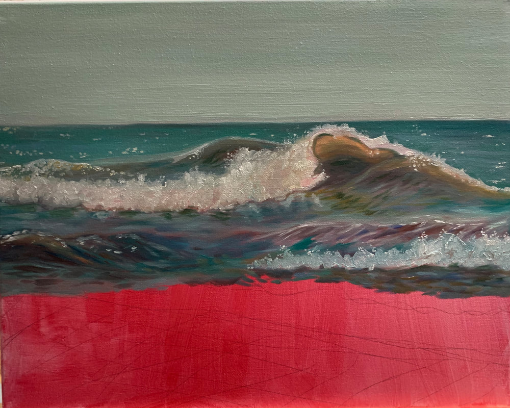
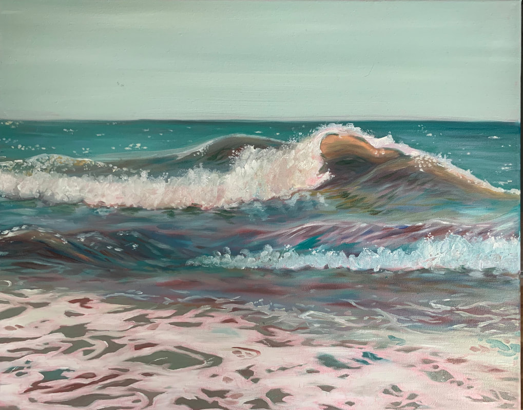
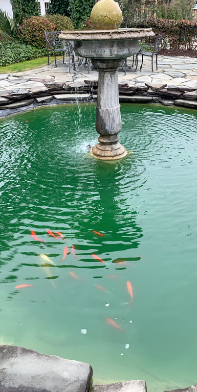
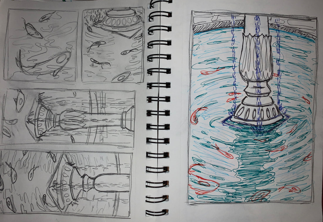
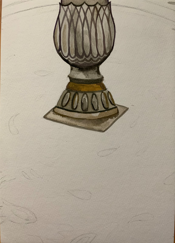
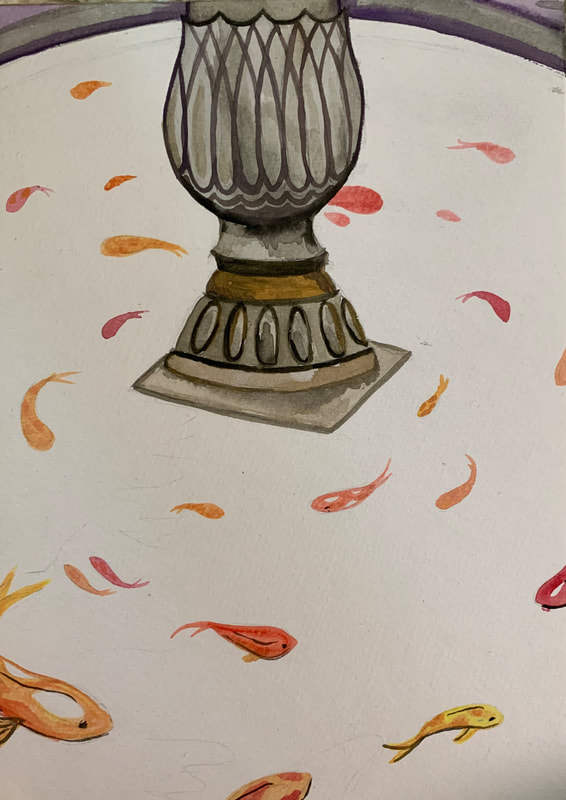
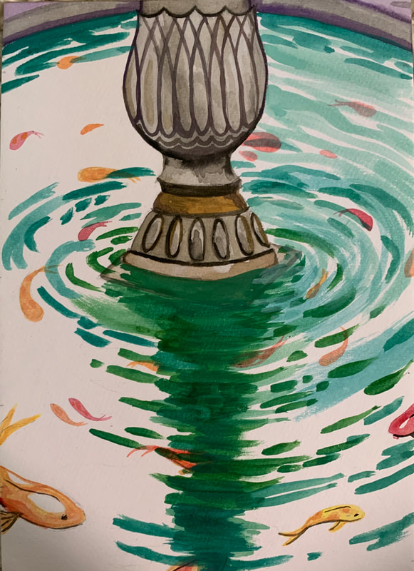
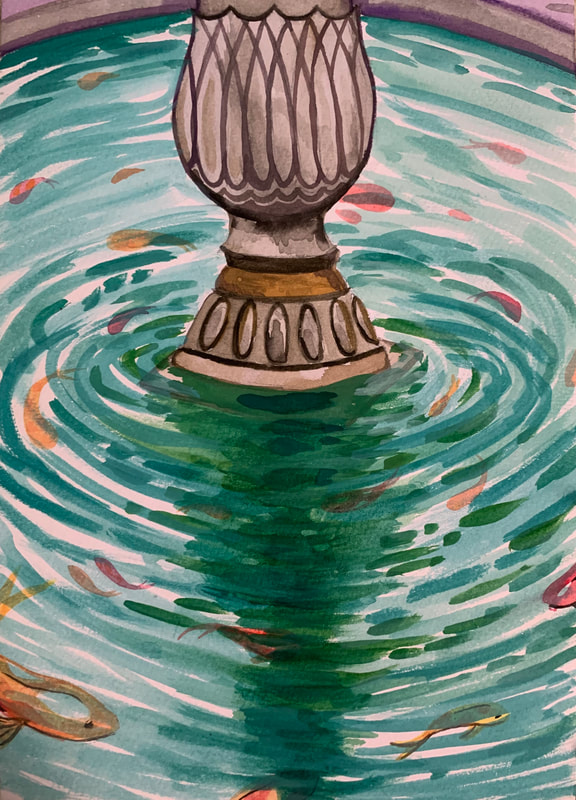
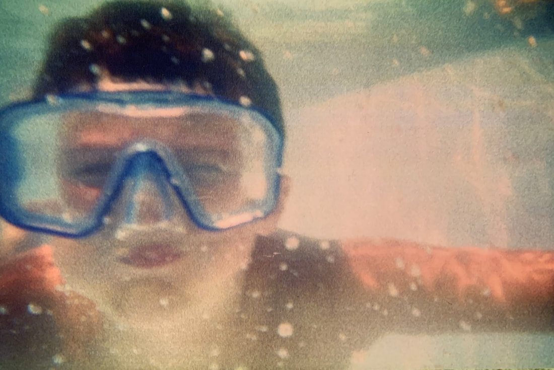
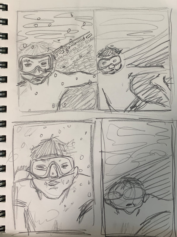
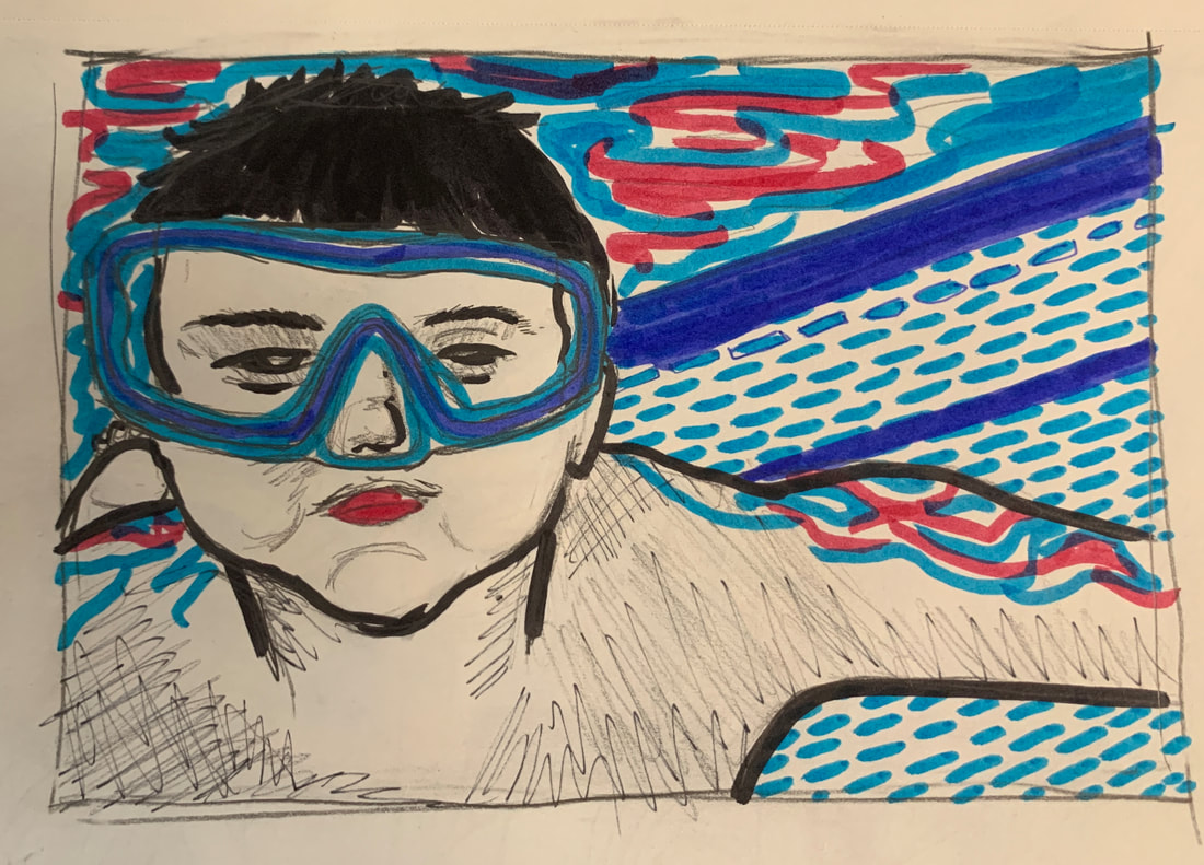
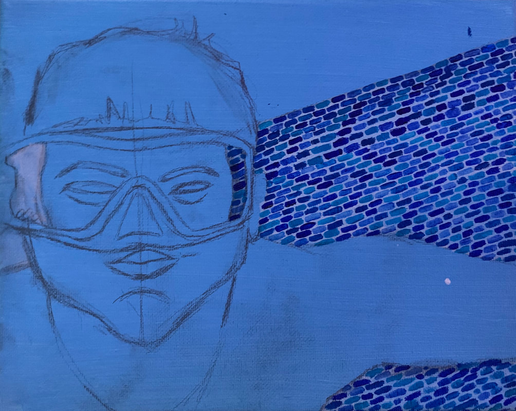
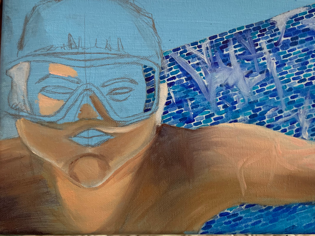
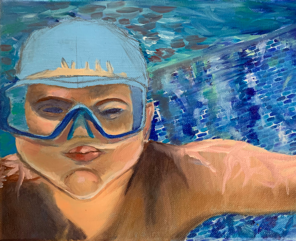
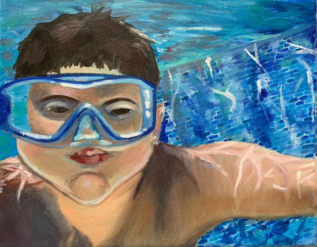
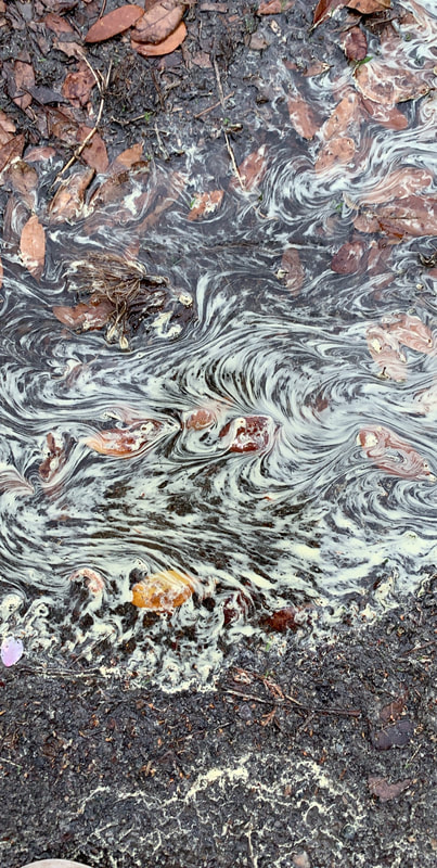
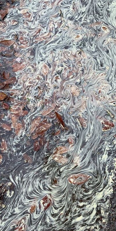
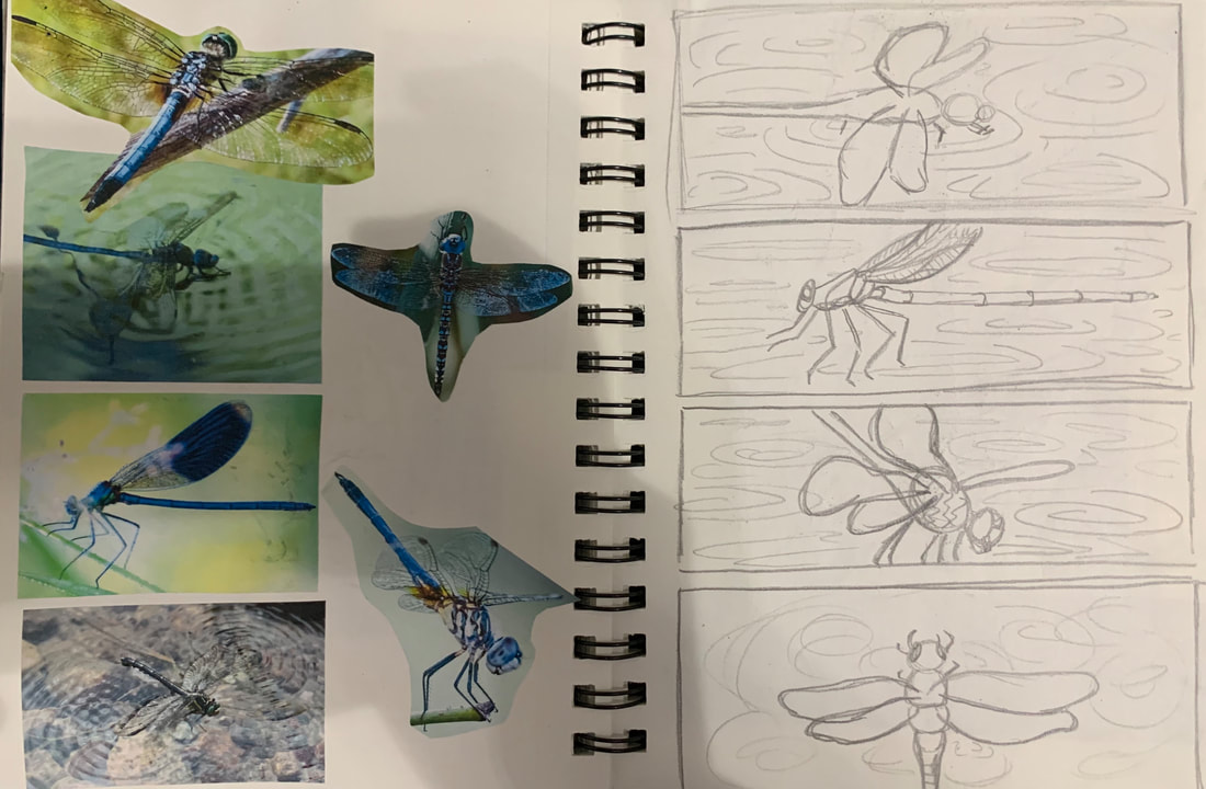
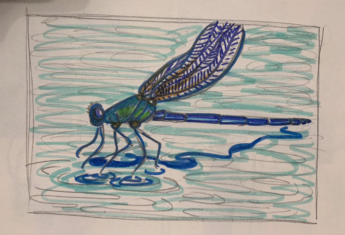
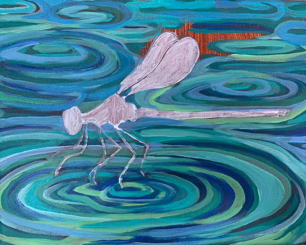
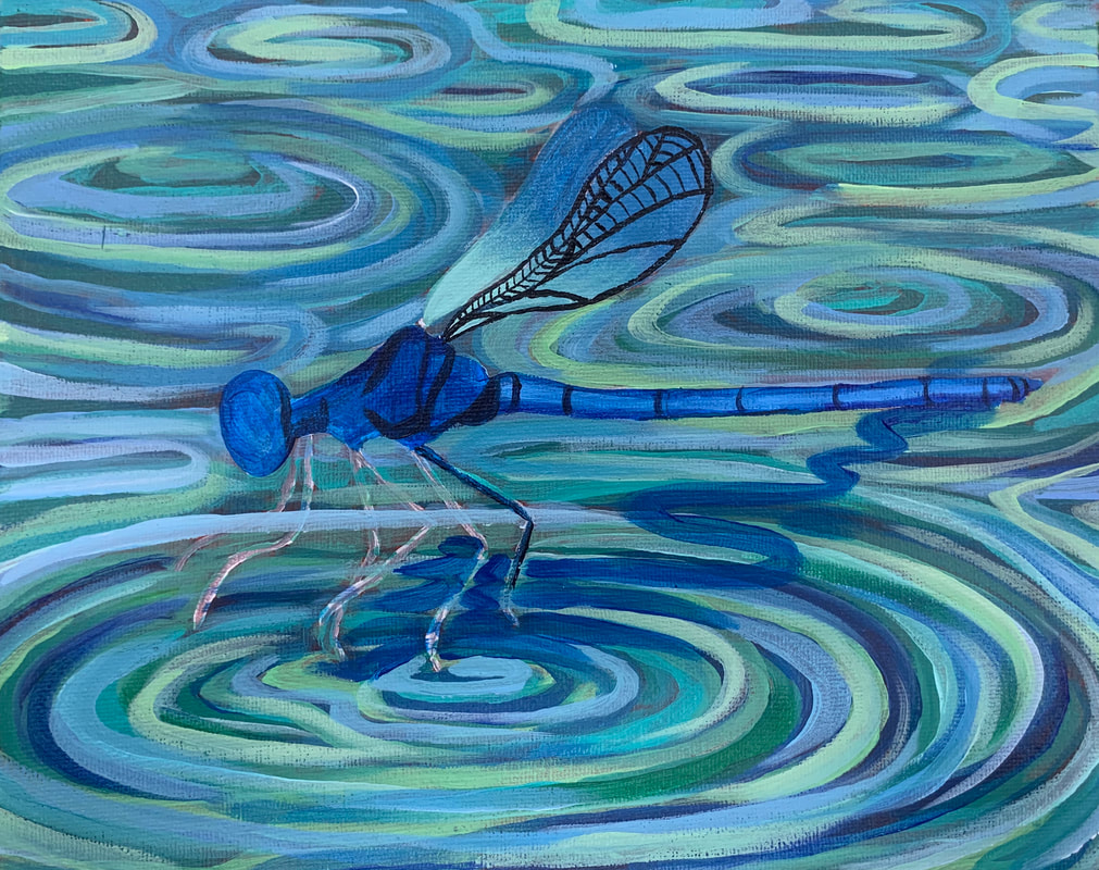
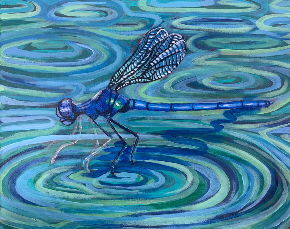
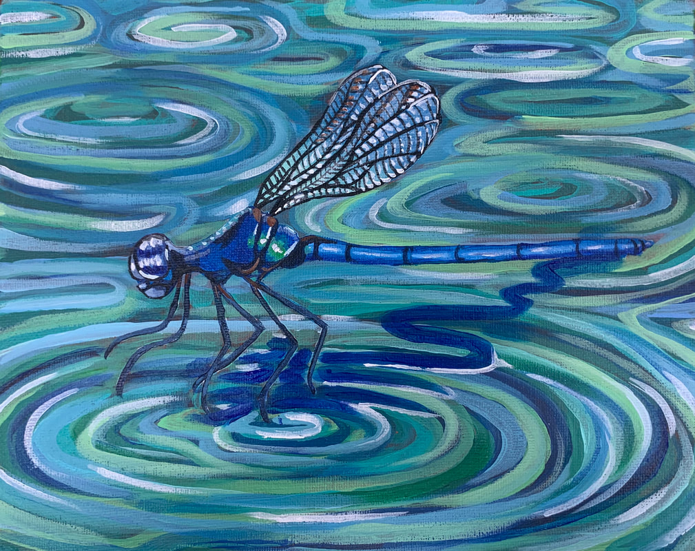
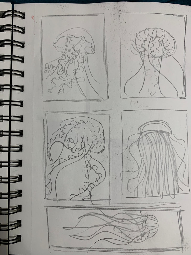
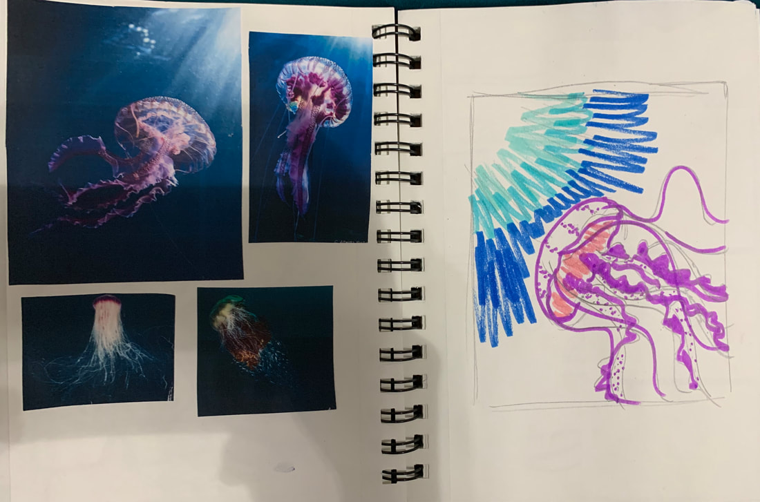
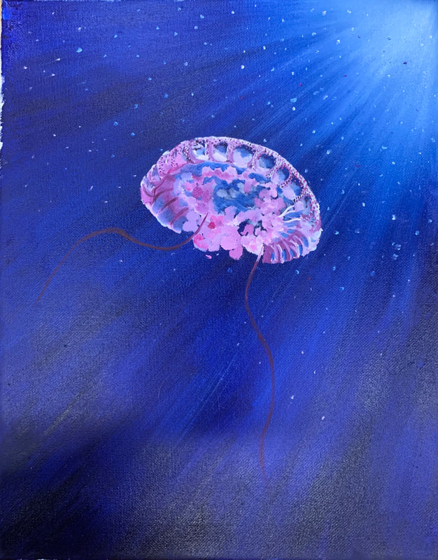
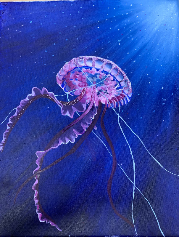
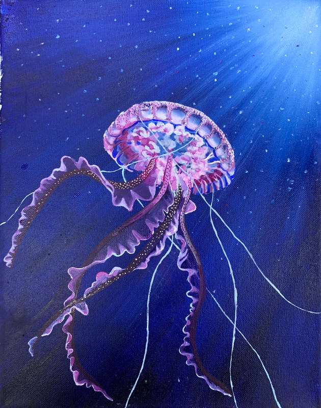
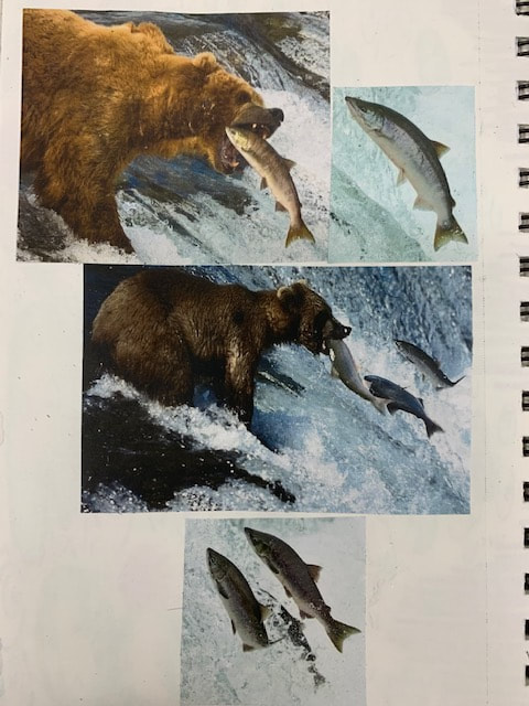
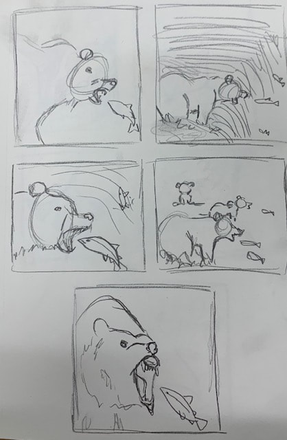
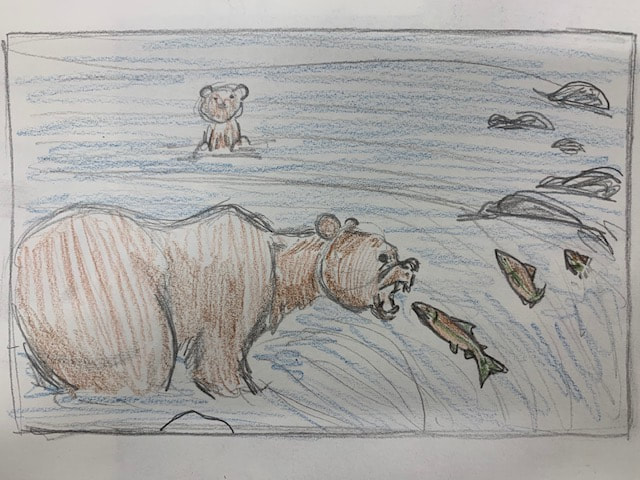
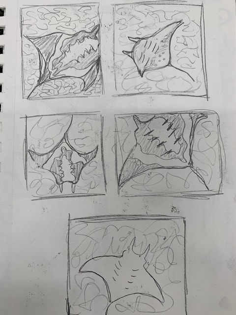
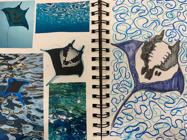

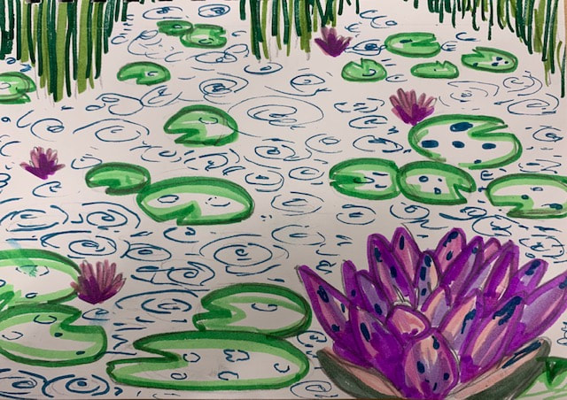
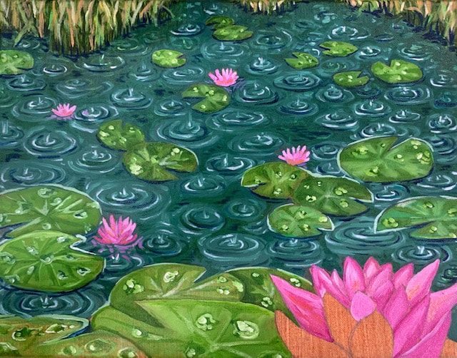
Photo used under Creative Commons from nahid-v
